The あたま/かしら should not be mixed. They ARE part of the same entry in the original dictionary, but they should only be grouped if they share the same definition (jisho.org handles this somewhat differently, where they are listed together, and the definitions are intermingled).
This should be working now.
木ノ葉,案価 <- this actually doesn't exist in the JMDict (base dictionary) presently. due to the original data import issue, there are a small but non-zero number of terms that were originally part of JMDict, added, and subsequently removed (but not from renshuu). This will, at a later stage, required going through them one-by-one. Due to the frequency of them, though, it is not considered a priority. It needs to be done, though!
You see that little pencil edit icon to the right side? That means those are custom terms on your acct.
I'm confused, because I'm reasonably certain that I never added those as custom terms, and I see those pencils for all terms without sentences. How do I go about eliminating the 3 extra terms ?
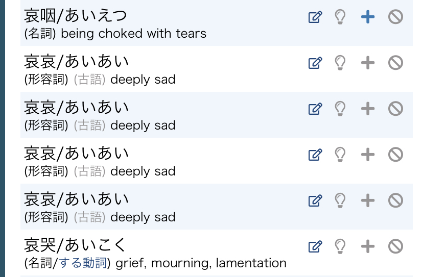
Should look better - and I'll remove the image from the first one. They are separated out in the dictionary because the definitions do not overlap (although I did update the def for #1)
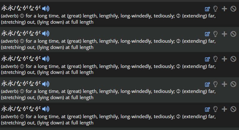
In the kanji dictionary, I found these 5 under 永 for なが.
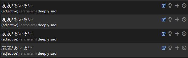
This seems similar to the 4 哀哀 duplicates found previously. I wonder if there is a more general issue with terms that only consisting of the same kanji twice ?
In the kanji dictionary, I found these 5 under 永 for なが.
This seems similar to the 4 哀哀 duplicates found previously. I wonder if there is a more general issue with terms that only consisting of the same kanji twice ?
I was able to track down the rest of these - they all seemed to come in from the same import period, and have been removed.
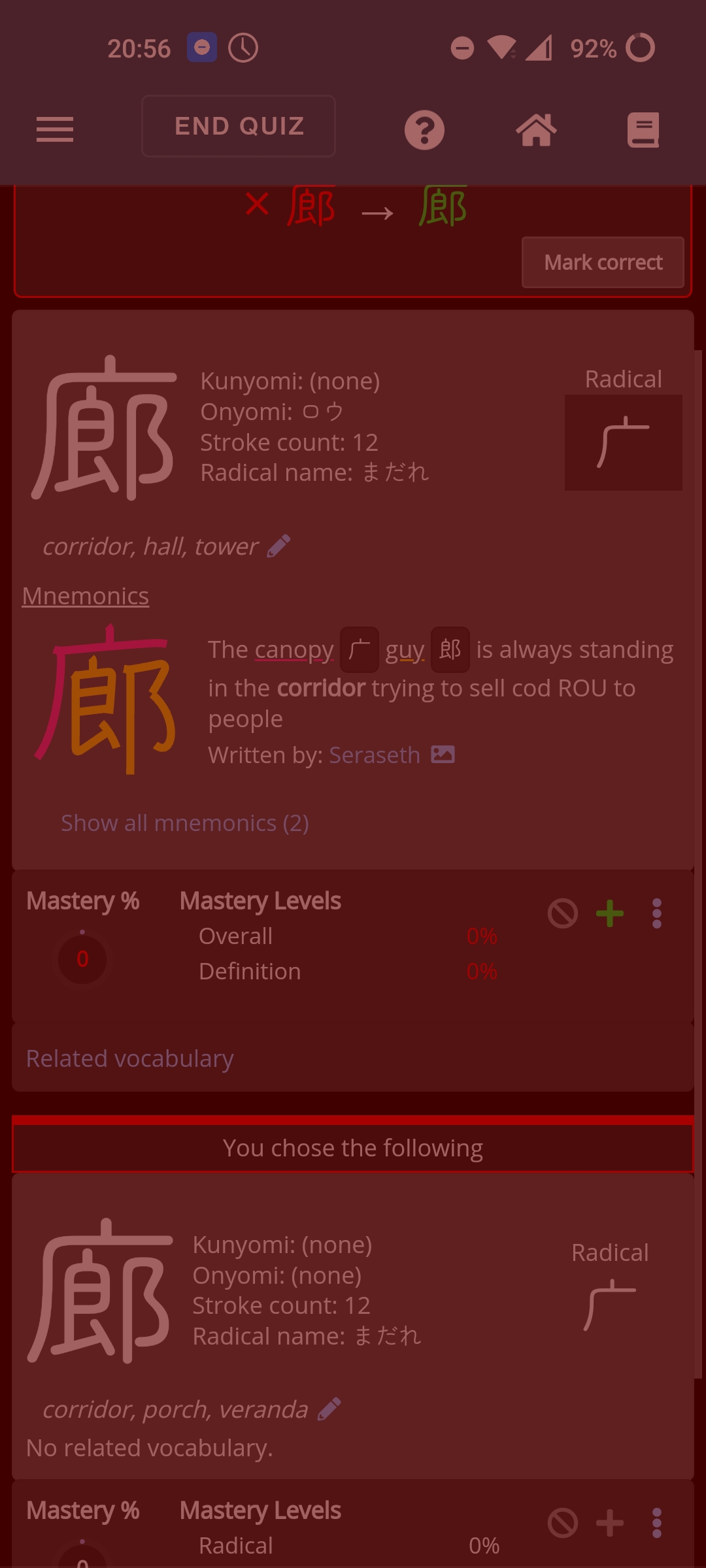
Ohww, thanks. Well that does explain it indeed. To me they look indeed the same. The meaning isn't that different either. Just that one line turns the coridor in a possible veranda instead of a tower. But thanks for getting back on it. I'm not sure how those special fonts work. Even on my keyboard they looked exactly the same and I have a simeji keyboard on my phone. I'm afraid this problem will persist unless I learn to write it.
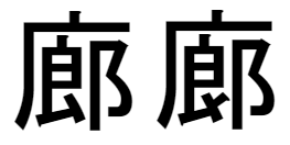
This is getting annoying. Anyone any ideas on how to let these special characters appear on an Android? These are the characters: 士 for gentleman and 土 for soil.
how to let these special characters appear on an Android?
I don't know how other than to install fonts that have entries/support for those characters. But I haven't messed with fonts on Android to recommend any.
FYI: 土 and 士 will always look similar, but I remember a dirt pile has a wide bottom (the bottom is wider) and the gentleman's got his arms out in a T-pose (the top is wider)
Thanks. That was helpfull. I know Google only accepts it's own fonts, but I'm not sure that goes for Japanese too. I'll try and install the Japanese language pack. Maybe that works. But even my Simeji keyboard does not distinct the ones of my former post, so I have little hope it will help.