Quite often I tap on "next question", and then ask myself "btw, what's the on'yomi?" Or "how do you use this word anyway"? Etc. I wish I could scroll down (or tap a button) and see the previous answer again. (and yes, I know I shouldn't hurry, and that haste makes waste, but if I answer correctly, my additional questions about the word or kanji sometimes come only once the new question appears).
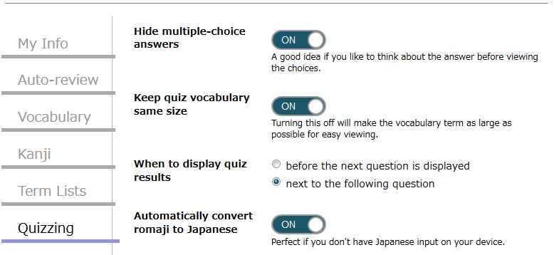
Undering Quizzing there is an item called "When to display quiz results" which you can set to "next to the following question". Depending on your screen width the quiz result box will either be shown to the right for the next question or below it (i.e. on a smartphone most certainly below, on a PC monitor more likely to the right).
Yes, I totally forgot to check the settings! On top of doing what I wanted, it skips one screen per question, which I don't check when I think I know the word well enough. 2 seconds times 100, that could save me over 3 minutes per day, thank you very much for the answer!
The only downside of this mode is that I don't see the button to report a synonym that was counted as a mistake. (but that's a separate issue related to the speedy mode, see below) It's extremely rare, because those synonyms have been reported for years now, but I just typed きゅうゆじょ for ガソリンスタンド, and it was counted wrong. Don't they mean exactly the same thing? The ja.wiki article indicates it's the same thing, and signals the additional synonym サービスステーション.
I think it says "problem?", then I can tick a box to indicate my answer should have been accepted. I couldn't find this button when I wanted to indicate a synonym, this morning, probably because I chose to display the results along the next question (below, in the case of a phone screen). And as indicated above, it's actually a group of 3 synonyms.
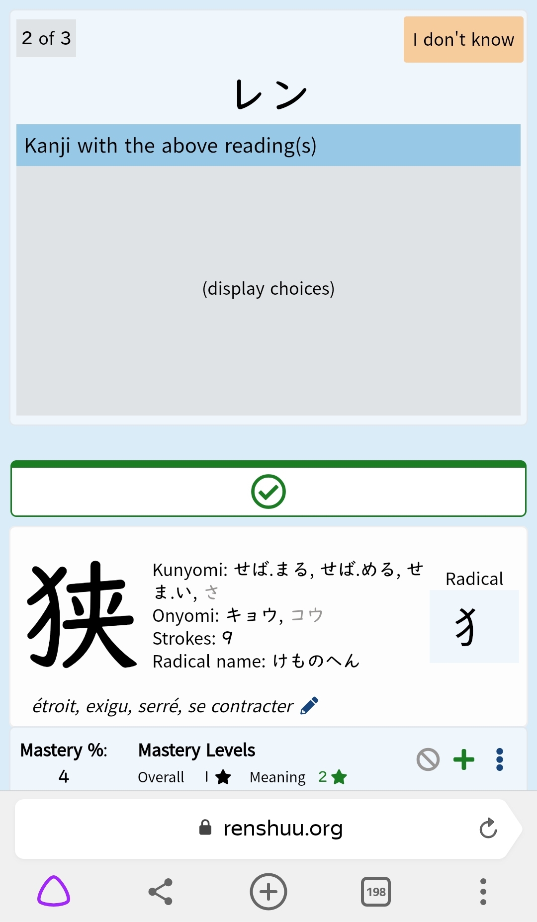
This is a kanji quiz, but there's normally also a "problem?" button on kanji quizzes, no? In any case what I see during vocab quizzes looks just the same. I don't know if with this display option the button should be at the top, or between the new question and the previous answer, but it's not there.
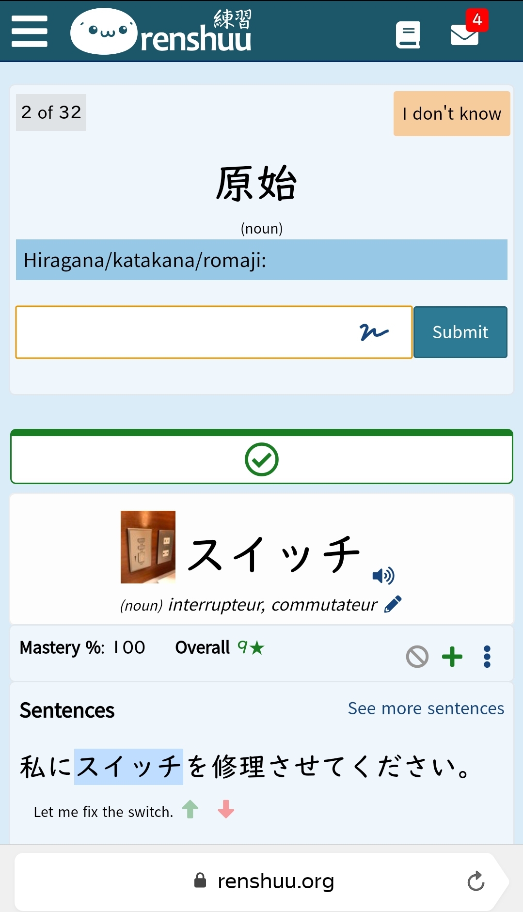
Sorry, I had forgotten the "problem?" button was in the top bar. Here it is, it's just like outside a quiz, with the logo, no "problem?" button. You probably also see on this pic that the illustration is often hard to identify on a phone screen. This pic seems to be a very light-coloured painting next to some kind of electric panel, maybe the heating system regulation panel, or maybe it's a safe built inside the wall. Or an oven. Electric plugs would be my 5th choice, switches would come 6th. Confusing. Maybe, if it were further to the left, the pic could use the first line of the definition, and be about +40% in both x and y (almost doubling in surface) That would very likely be enough for most pics. Currently only a minority of the pics have the desired effect, during a quiz. For those, it really helps, I'm associating pics with meanings and words, so the pics sometimes serve as a bridge between a word and its meaning, which is why I'm hoping for more of such effect.
Ahh... Sorry! Since I noticed the issue only after changing the way the answers are displayed, I had no clue it could be related to the speedy mode, I was even quite sure it wasn't. I thought the button was there until I switched the way the answers are displayed.