Text editor is now very white. Don't know if I should put this here either. Also, question: Is Dark Mode new in Beta, or have I just never found it before?
Was it right after you changed to dark mode? (And yes, it's been here for awhile) - Small limitation - it doesn't switch editors already on the page, but it should appear properly if you go to a different page and open up an editor.
Fixed! I made a bunch of optimizations to the stroke diagrams elsewhere in the site, and one of the optimizations conflicted with this page. It's fixed!
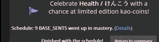
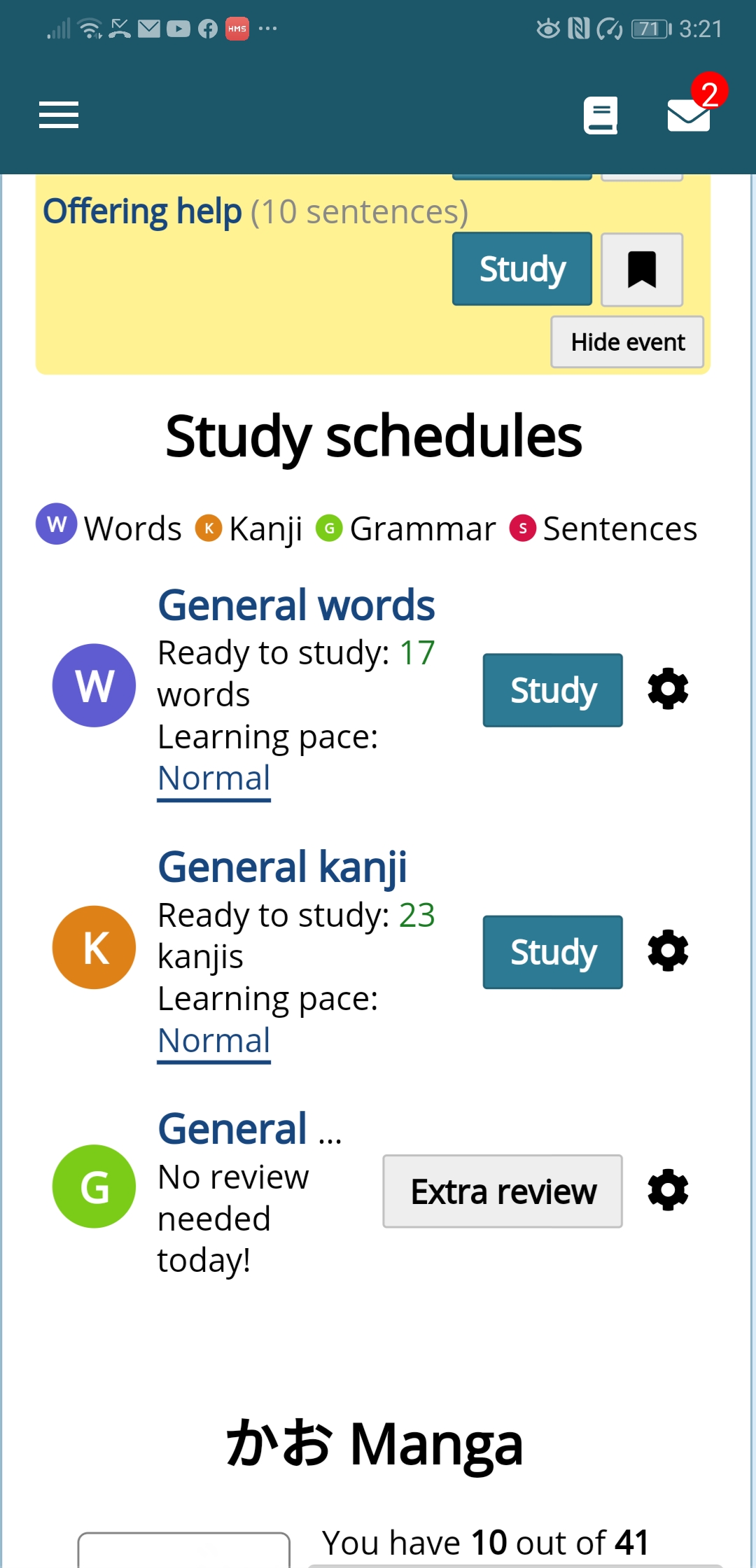
Another from yesterday text alignment issue with grammar as dots. Is the best place to comment on issues? Also is there a way to get to latest post without going through 16 pages. Great app otherwise
Ooh, I see a lot of tiny visual issues in there. I'll get at them soon! In the meantime, could you go here https://whatismyviewport.com/ and tell me what it says your viewport size is? Most of the issues are coming from that, so if I know what yours is at, I can test more quickly. Thanks!
Ooh, I see a lot of tiny visual issues in there. I'll get at them soon! In the meantime, could you go here https://whatismyviewport.com/ and tell me what it says your viewport size is? Most of the issues are coming from that, so if I know what yours is at, I can test more quickly. Thanks!
360X664
Thanks for that link it will help me fix css issues in some other code I am testing
3. Coloring doesn't change, at least not yet. Not much space to work with in there, but I'm thinking about it.
2. Should be fixed!
1. Do you have your browser at a non-100% zoom? I can't replicate this one.
Two is fixed. One - I only see it in dark mode, in Light mode it doesn't appear. It looks a bit like the top borders of the drop downs. My browser is at 100% zoom.
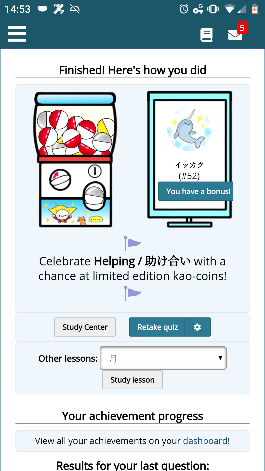
#2 looks good. I haven't seen #4 again yet. On the mobile version (not the app) "Touch the dial for your gacha spin!" doesn't fit in the box.
It looks a little odd to me, but I could get used to it. The font on the Japanese buttons looks maybe a little bigger than the English, and they definitely have more padding inside and outside which is what keeps them from fitting, at least on my phone (Moto X4).