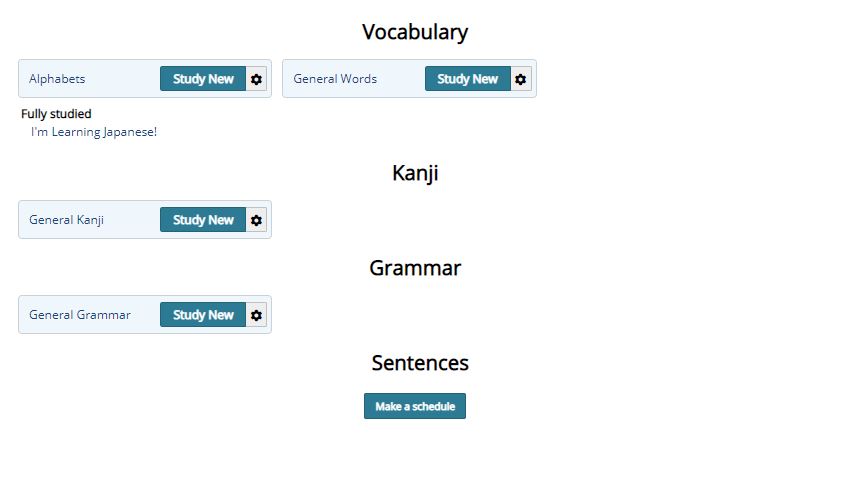
Compact mode currently works best for users that have a lot of schedules. I do need to rethink it, though - it is not as compact as I'd like it to be in that situation, and definitely not in you where you only have a couple of schedules per type.
Can I ask you what you where expecting, generally? Outside of compact mode, it already fits into a relatively tight space. The only thing I can think of that would make it smaller is to mix the schedule types and add a single character on the the front of the names to represent the types. (so [V] would represent vocabulary, for example).
Hover over doesn't work for mobile, unfortunately. It's tricky coming up with solutions that work for both pc and mobile devices! I'll think of something, though.
I thought about that some time ago, but thinking up icons for the four of them that would be relatively clear to new users (it's easy keeping long time users around, but keeping new users around is the tricky thing.
Since the Japanese versions are all two kanji, (言葉、漢字、文法、文章), maybe two letters (Wo, Ka, Gr, Se) after a quick introduction would stick easily with new users.
I'm working on the android app at the moment, but I will be making some changes to the visuals of the schedules in the next beta round.