Vocabulary dictionary

Kanji dictionary

Grammar dictionary

Sentence lookup

test
 

Forums - Update Notes for new.renshuu.org

Top > renshuu.org > Feature Requests/Improvements > Finished/Rejected Requests

Page: 1 of 4


avatar
マイコー
Level: 262

If you are on the new server, below is a detailed list of everything new. Discussions about new things can go here, while bug reports should go in the Experimental features forum (link just above this post)

Current status: available on the new server!!

New Features

**[Feature]** Under Quizzing (in Settings), you can now disable the panels that show information about your incorrect answers

**[Experimental]** CONJUGATION schedules!!!!! Add them via the Experimental panel (in settings)

Notes: includes verb and adjective schedules. Feeds off of the conjugation quizzes in the Lesson Center, so it should work a similar way, but more testing is needed

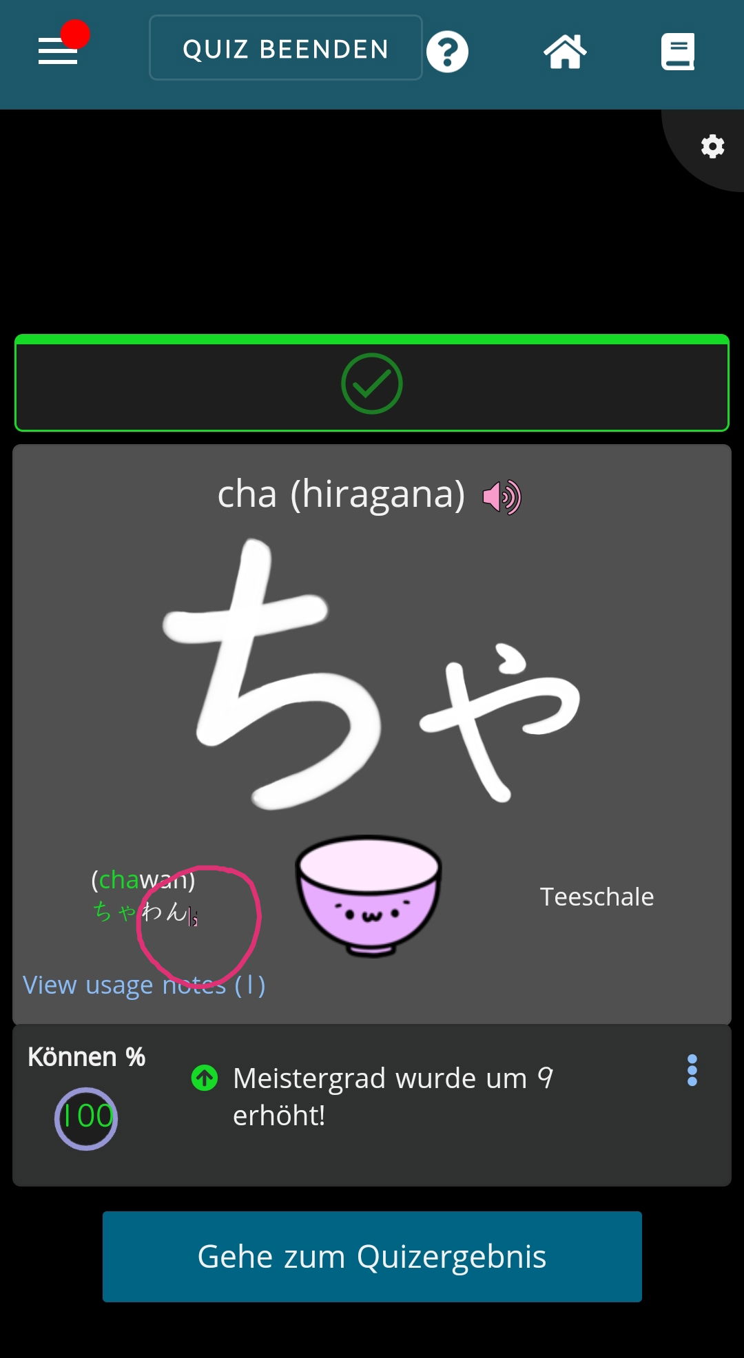
**[Experimental]** New setting (under Experimental in settings) which will show furigana above unknown kanji in multiple choice answer boxes.

Notes: This is highly experimental, so please try it out. Keep in mind that you need to also have the Vocabulary setting (how to show unknown kanji) to the first option (show the kanji with furigana)


Improvements

**[Improvement]** Settings panel adjusted (Lessons category removed, options being shifted to Vocab or Kanji categories)

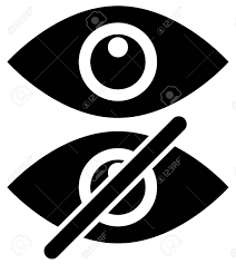
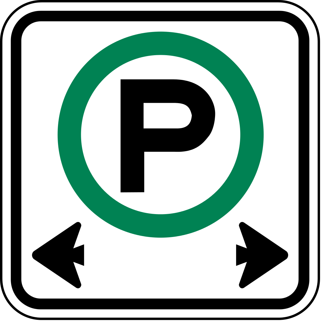
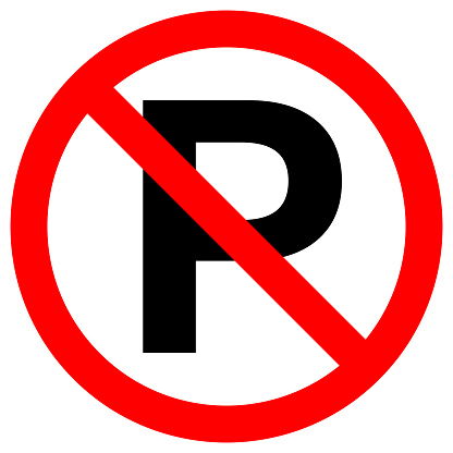
**[Improvement]** A lot of icons swapped over to renshuu-made hand-drawn artwork. Please let me know if anything looks off!

Notes: the up/down arrows for sentences will be replaced soon, too. Particularly interested in any visibly issues regarding the icons. They were designed in the hopes of using both color and shape to show on/off states, instead of just the "colored or grey" setup.

**[Improvement]** Usage notes for words will also show your notes, even if you have the category deselected for other users.

**[Improvement]** Usage notes with word links will allow you to link a single usage note up to multiple words. Works when editing previously made notes, too.

Notes: this is not an automatic process for previously made notes, so if you have made a note that, say, compares two or more words, definitely go and edit them. More info here: https://www.renshuu.org/forums...

**[Improvement]** Grammar usage notes now have language and privacy settings. At some point, will backtrack through previous notes and mark up non-English ones.

**[Improvement]** Better back/close button functionality when going through multiple grammar pages in a row.

**[Improvement]** Users who are logged in via a Google account can now also set a password through the settings panel.

**[Improvement]** You can now bookmark and add-to-schedule from a list's page.

**[Improvement]** When editing a list, it can be marked as finished. This will hide it when using tools in discord, as well as when listing the lessons in the add/remove box

**[Improvement]** Definition hints available for vocabulary writing practice questions

**[Improvement]** Link to adjust mastery added to ... menu in vocab dictionary

**[Improvement]** Our learning events on Discord that follow along the Japanese Basics lessons are now available on the Japanese Basics page!

**[Improvement]** Improved layout on compact view for schedules

**[Improvement]** If you search a kanji compound in the kanji dictionary, it will search for both/all kanji.

**[Improvement]** On grammar expression quizzes in the Lesson Center, renshuu pro users can now choose to limit the number of questions per expression (due to a larger pool of questions to draw from).

**[Improvement]** You can now add terms and lessons to schedules that are fixed on a lesson-by-lesson path (most of the ones that renshuu has).

**[Improvement]** Counter punch now has correct/incorrect markers in addition to colors (after answering) to help differentiate choices.

**[Improvement]** Grammar search (in dictionary) catches more variations of some expressions (Ex. としては now returns page for として)

Fixes / Changes

**[Fix]** Kanji mnemonics will display your mnemonics first, if present.

**[Fix]** Fill-in-the-blank preferences for vocabulary schedules where not always being saved.

**[Fix]** When changing writing box size, the setting did not always stick

**[Fix]** Game was starting prematurely in Quick Draw if you tried to change the drawing speed.

**[Fix]** Improvements on hiding romaji in question answers, as well as slight improvements in the definition simplifying process.

**[Name changes]** (In progress) Lesson Center -> Community Lists, Japanese Basics -> Japanese Lessons

Notes: also considering simplifying the button language for schedules, feedback wanted:

(changes under consideration)

Focused Review > Review

Learn & Study > Learn

Learn New > Learn

(In other words, it'll be either Study, Learn, or Review. "Learn & Study" and "Learn New" were somewhat repetitive because the "xx to study, yy to learn" text is just to the left.

26
6 months ago
Report Content
avatar
カリンくん
Level: 341

Unfortunately, for me at least, the verb CONJUGATION schedule doesn’t really work yet … most of the time the quiz fails to start, in others cases after a few questions it fails, in both cases with an error. Moreso, in some cases even my quiz style settings got messed up.

I must add, that I run the quiz with my own settings - ie. typing, not multiple choice, etc.

0
5 months ago
Report Content
avatar
Elessar
Level: 266

Two notes on improvements:

1. Thanks for adding the mastery adjustment in the vocab dictionary! Could you do the same for kanji & grammar? (Maybe you could just make the word "Mastery" clickable, which brings up the adjustment box?)

2. The new icons make the buttons bigger, which is easier to see & to click on. A few visual things I noticed regarding them; For the listening questions, the icon is below center. For the writing pad, only the trash can is updated, which leaves a lot of icons still to be changed. However, should they be changed, I'm not sure if the suggestion buttons will look out-of-place or not. I doubt that it would be possible to change those buttons to match the style easily, but one suggestion would be to increase the button font size by one or two points to match the bigger buttons of the new icon style.


1
5 months ago
Report Content
avatar
Sullydude
Level: 27

I'm not sure whether this is unique to the new servers, however i don't remember seeing this happen on the old ones. some things to note is that this happened with both the Textbook font and the Basic font, another thing is that this happened with Adventure Mode and Kao Coins disabled so that may affect it (If you can't tell what's happening in the picture, I got 100% on a schedule however the '1' and part of the '%' was cut off)

1
5 months ago
Report Content
avatar
gillianfaith
Level: 887

Meatball menu for words in the dictionary ^^^

The icon for "Link another word" should probably not be a trashcan? And having the majority of the icons here be pencils makes it hard to tell which options are available at a glance, though I'm not really sure what they would be replaced with.

4
5 months ago
Report Content
avatar
Vasnody
Level: 353

I think the idea of relying on different shapes instead of colours to tell the difference between icons is really cool, but as of right now I think they just don't fit the overall look of Renshuu... Especially the "block" one. It's got this red outline that makes my brain go "ohhh this term is blocked", when in reality it's not. Although it's probably just a matter of habit at this point.

I'd suggest making 2 sets of icons, both old and new ones, and make a setting in "visuals" to switch between them.

3
5 months ago
Report Content
avatar
Elessar
Level: 266

Vasnody は 1127, 6:04に

I think the idea of relying on different shapes instead of colours to tell the difference between icons is really cool, but as of right now I think they just don't fit the overall look of Renshuu... Especially the "block" one. It's got this red outline that makes my brain go "ohhh this term is blocked", when in reality it's not. Although it's probably just a matter of habit at this point.

I'd suggest making 2 sets of icons, both old and new ones, and make a setting in "visuals" to switch between them.

I think that one of the reasons that the "block" icon looks out of place is that it doesn't have a black outline like the other icons.


The icon for "Link another word" should probably not be a trashcan? And having the majority of the icons here be pencils makes it hard to tell which options are available at a glance, though I'm not really sure what they would be replaced with.

Yes, the "Link" should probably be a chain link. Possible suggestions for the other menu items are:

Adjust mastery: pie chart or bar graph

Add sentence: speech bubble

Report mistake: emoticon with "x"s instead of eyes (kind of like this: 
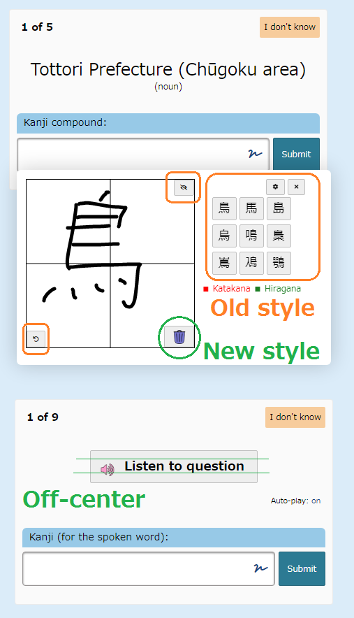
, in fact, you could just use this icon!)

Add usage note: the pencil works great! Just leave it as is.

2
5 months ago
Report Content
avatar
マイコー
Level: 262

1. 100% text was fixed for users not using Kao coins

2. That trashcan for the link action was definitely a mistake, has been fixed.

3. Alignment on "listen to question" button fixed.

4. trashcan on drawing pad reverted for now - I'm trying to not mix-match icon styles until we have enough to fully switch over a section.

5. We will most likely have more icons for the vocab popout options, it's just "pencil works well enough" for now. Definitely not planned for long-term.

6. Not all the icons have black outlines - the plus button, for example, does not, nor does the lightbulb. Also,

7. I am DEFINITELY not maintaining two different icon sets - it's more settings, more code bloat, and more spots for bugs/issues to pop up, pulling me away from more valuable areas of improvement.

That being said, the block icon is the one I am conflicted on the most - we have gone through a lot of revisions, nothing that looks good to me. The lightbulb on/off looks perfect, in my opinion. The plus icon is 80 points (out of 100), and the upcoming heart revision should be similar to the lightbulb (heart outline if you haven't liked something, filled heart if you have).

So, I'm not crazy about having some of the "on/off" icons do the "outline vs filled" thing, while others do some other mechanic. I definitely want a (and I think that's all of them - there are no other on/off icons in all of renshuu) unified experience so it's as clear as possible how the buttons work, and what state they are in.

But again, I do not feel like it's ideal yet, and will gladly listen to other ideas for them, especially the block one.

Also, keep in mind that I plan to remove the up/down arrows for sentences and replace them with heart/block, as downvoting a sentence/user note/mnemonic is the same as hiding it, so it makes sense.

Maybe drop the block icon altogether, and do a visible-style icon ? (quick copy/paste from google)

Not sure I want eyes everywhere, but maybe that fits the actual usage more..

4
5 months ago
Report Content
avatar

Not sure I want eyes everywhere, but

I think you wise to be cautious. 👀

1
5 months ago
Report Content
avatar
Level: 327


But again, I do not feel like it's ideal yet, and will gladly listen to other ideas for them, especially the block one.

Also, keep in mind that I plan to remove the up/down arrows for sentences and replace them with heart/block, as downvoting a sentence/user note/mnemonic is the same as hiding it, so it makes sense.

Maybe drop the block icon altogether, and do a visible-style icon ? (quick copy/paste from google)

Not sure I want eyes everywhere, but maybe that fits the actual usage more..


Maybe the outer circle for the current icon should be gray and the X mark in the middle should go from gray to red instead. The gray X mark means the word is visible, and the red X mark means it's marked as blocked or invisible?

0
5 months ago
Report Content
avatar
Anonymous123
Level: 1205

For blocked/not blocked symbols I'd suggest the road sign symbols:

-Red circle with slash (blocked, not allowed)

-Open Green circle (not blocked, allowed)

1
5 months ago
Report Content
avatar
マイコー
Level: 262

Most of the on/off icons are single color (as in, they do not toggle between two "active" colors), so I'm not sure I want to take green (which is used elsewhere) and apply it to the blocked icon...

Also: mind showing me which street signs you're thinking of?

0
5 months ago
Report Content
avatar
マイコー
Level: 262

Sorry for the stream-of-consciousness messages - Not sure the green dynamic would work, even if I was fine with the color usage - I want this to act as a block for not just terms, but sentences, etc., so having a green circle (or something similar) next to all the sentences is not going to be clear.

0
5 months ago
Report Content
avatar
Level: 327

The only alternative I can think of at the moment for the block button is to have a circle with a "pupil" in the middle when the term is visible, and a slash or X mark in the center of the circle when the term is blocked. Both can be the same color as long as the pupil and slash / X mark are highly visible at a glance.

0
5 months ago
Report Content
avatar
マイコー
Level: 262

If we did the eye, it could be grey for normal, grey with red line through it for blocked - it would make a nice transition from the old icon (slash in both versions).

2
5 months ago
Report Content
avatar
Level: 327

I think that'll work

1
5 months ago
Report Content
avatar
Anonymous123
Level: 1205

Most of the on/off icons are single color (as in, they do not toggle between two "active" colors), so I'm not sure I want to take green (which is used elsewhere) and apply it to the blocked icon...

Also: mind showing me which street signs you're thinking of?


Road signs in many regions have an open green circle for permitted activities, and the red circle with a slash for activities not allowed.

Parking, No parking signs is one example (shown below).

Other examples include:

-Passing, No passing signs

-Bicycles, No bicycles signs

-Right turn allowed, No right turn

etc.


1
5 months ago
Report Content
avatar
Vasnody
Level: 353

Speaking of icons, I think the "voice" button shouldn't be red. I mean right now it's not like... Reeeealy red, it's more of a pinkish hint, but I think the older green worked better. Also it probably doesn't fit the current colour palette

0
5 months ago
Report Content
avatar
Level: 371

I suspect the scaling of the icon is not correct here.

1
5 months ago
Report Content
avatar
マイコー
Level: 262

Should be fixed!

0
5 months ago
Report Content
Getting the posts


Page: 1 of 4


Top > renshuu.org > Feature Requests/Improvements > Finished/Rejected Requests


Loading the list
Lv.

Sorry, there was an error on renshuu! If it's OK, please describe what you were doing. This will help us fix the issue.

Characters to show:


Use your mouse or finger to write characters in the box.
■ Katakana ■ Hiragana