Thanks for the feedback - let address each point (not necessarily in order):
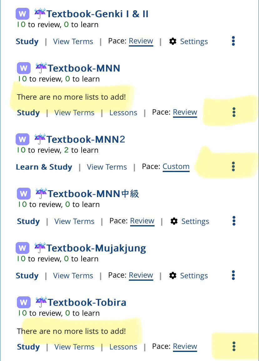
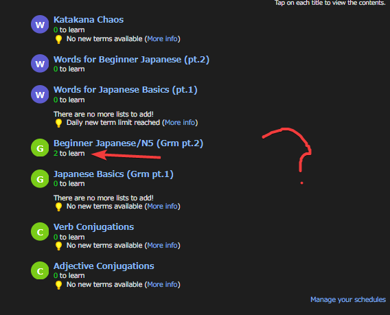
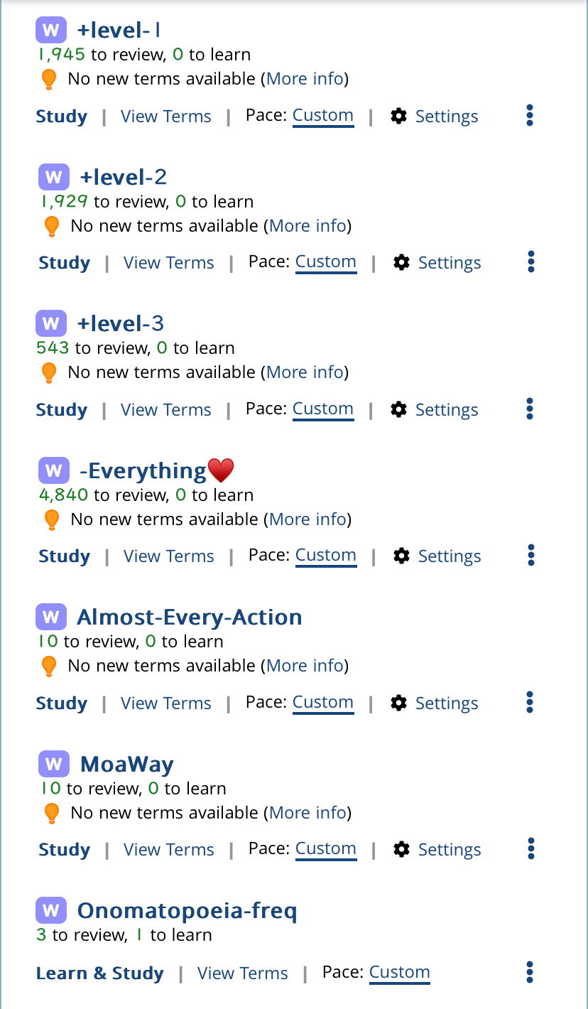
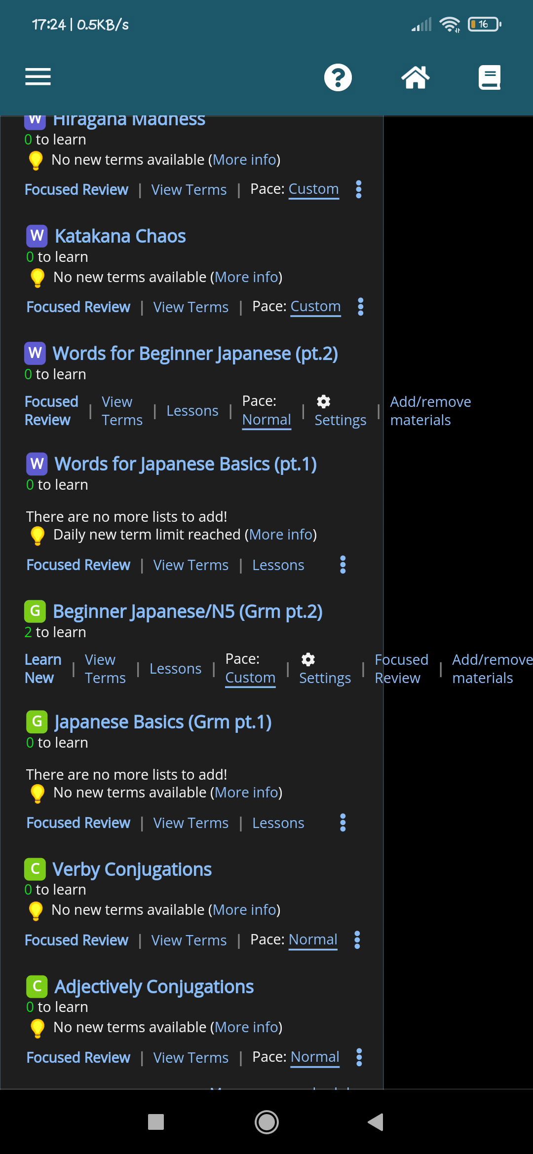
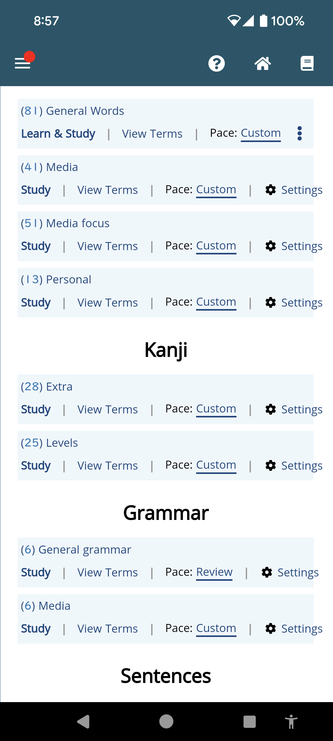
1. A huge number of users would like easier access to the terms in each schedule - that has been made exceedingly clear, and most users are not power users, but casual ones - I do my best to strike a balance between the two groups, but right now, way too many people are saying "I cannot find x, y, and z in the schedules", so this is to help address that.
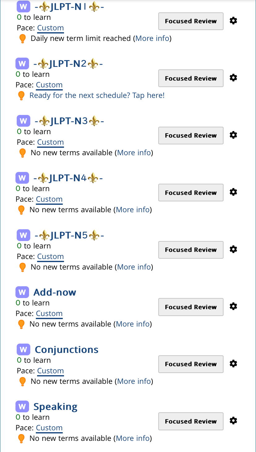
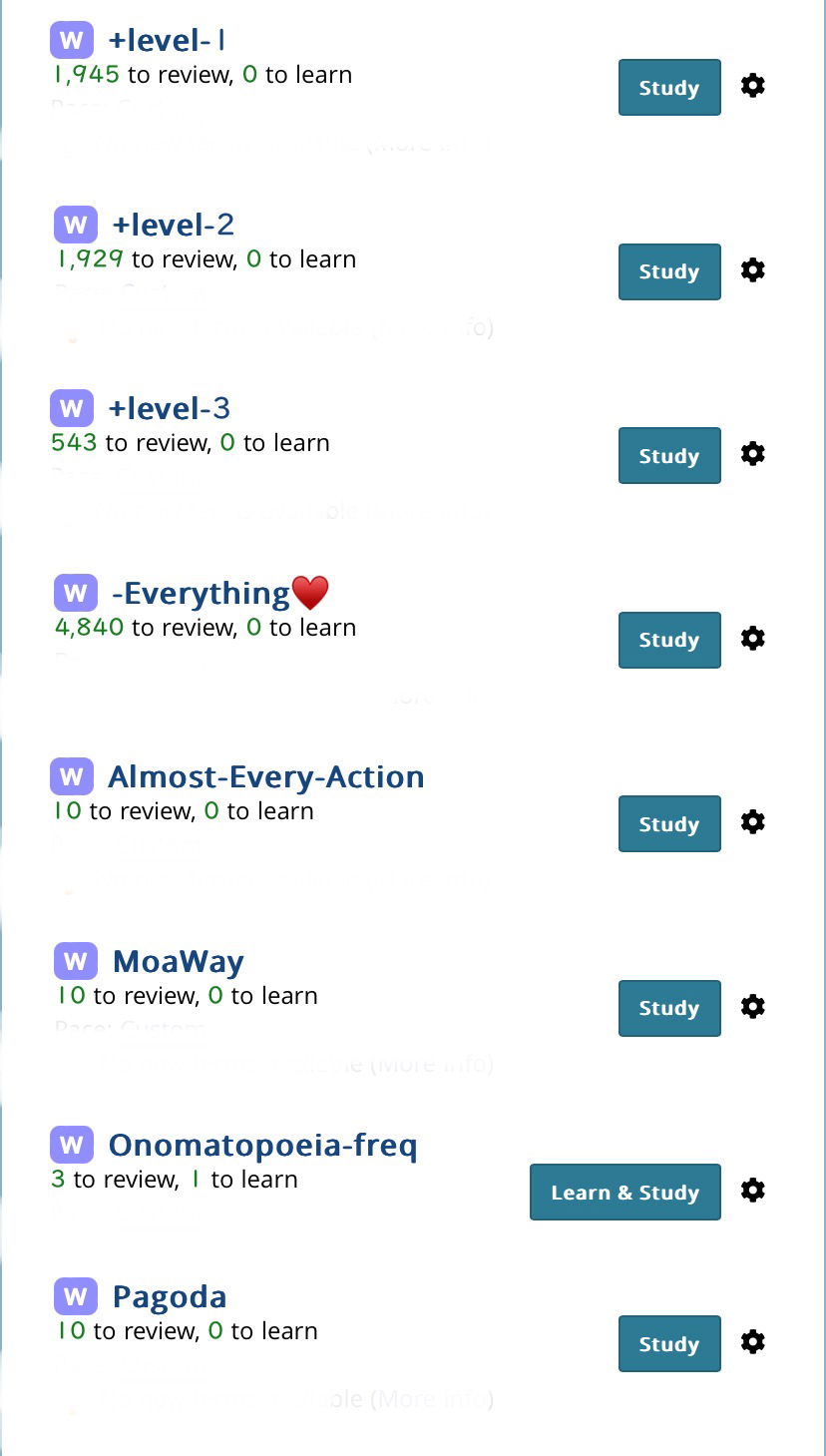
2. The study link will always be on the left. I tried (earlier) doing a button style for that first link, since it's the main one, but it didn't look good. That being said, most users (casual or otherwise) do not have the visual width that you do, and the large buttons plus longer schedules was causing a lot of cropping and bumping into one anther, so "Japanese Basics" might be "Japanese Ba..." for many users.
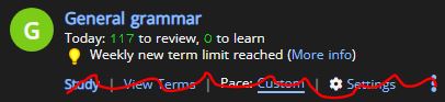
3. I think adding a way to hide those no-new term alerts would be excellent, and I think I can do that.
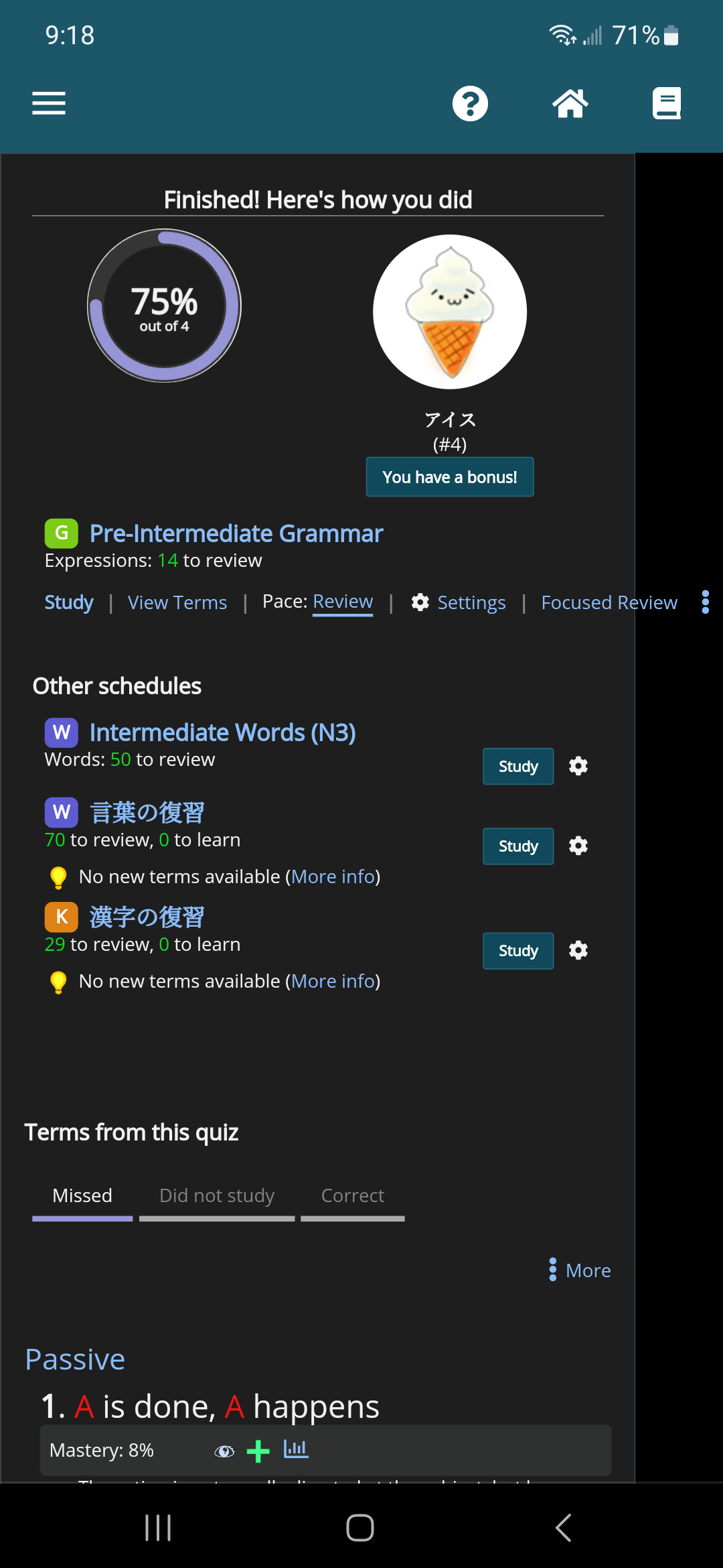
4. While I do see where you are coming from with regards to the blue/grey dynamic, a good number of people see "grey" as "not clickable" - while I know that many people do not see that, it felt like the blue buttons were "on", and the focused review ones are "off"
As I noted before, this is not a final draft, so I really appreciate this feedback, and hope to get more like that. I have no doubt I can continue to improve on the design and fit in the wishes of the majority of users.


 if it's a hassle to maintain multiple layouts I don't think it's necessary to keep.