Vocabulary dictionary

Kanji dictionary

Grammar dictionary

Sentence lookup

test
 

Forums - New schedule layout

Top > renshuu.org > Feature Requests/Improvements > Finished/Rejected Requests

Page: 1 of 3


avatar
マイコー
Level: 262

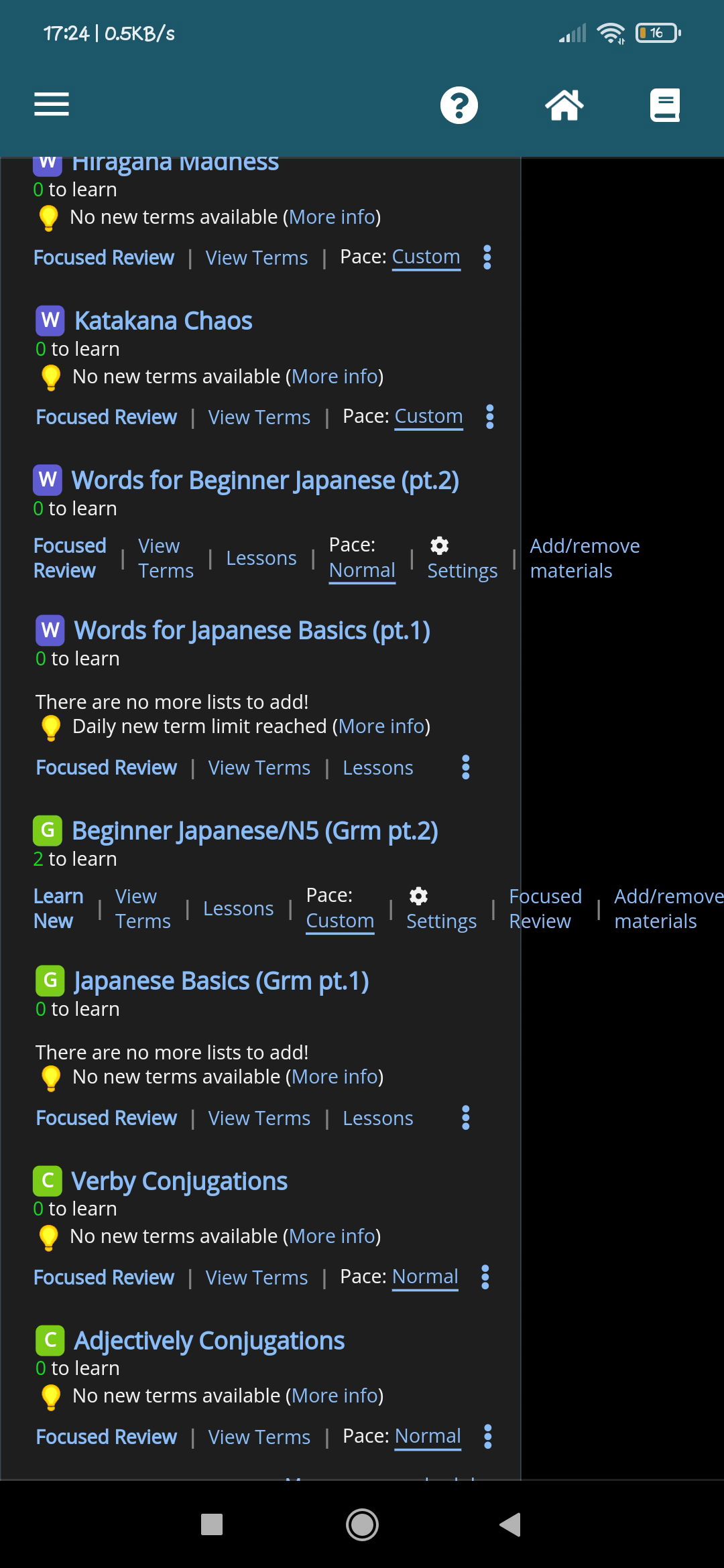
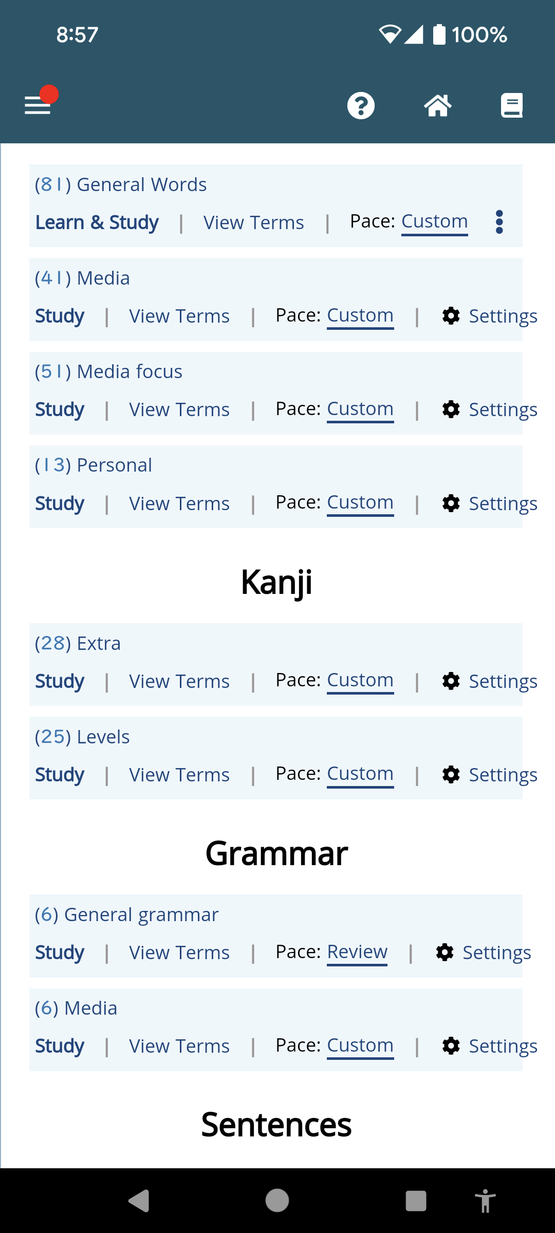
This will be rolled out to all users, so if you have opinions, definitely let me know!

Improvements

1. Easy access to the list of contents

2. For grammar schedules, easy access to the mini lessons

3. For all lesson-based schedules, easy to see current lesson, and how many have been done/are left

4. Easier access to focused review (no longer embedded in the settings panel), as well as Adjust Materials

5. The layout is "flatter", so it's easier to scan and find what you want, and works more uniformly across different sizes.


3
5 months ago
Report Content
avatar
Level:

Wheres the learn new button?? I am just asking

0
5 months ago
Report Content
avatar
Level: 328

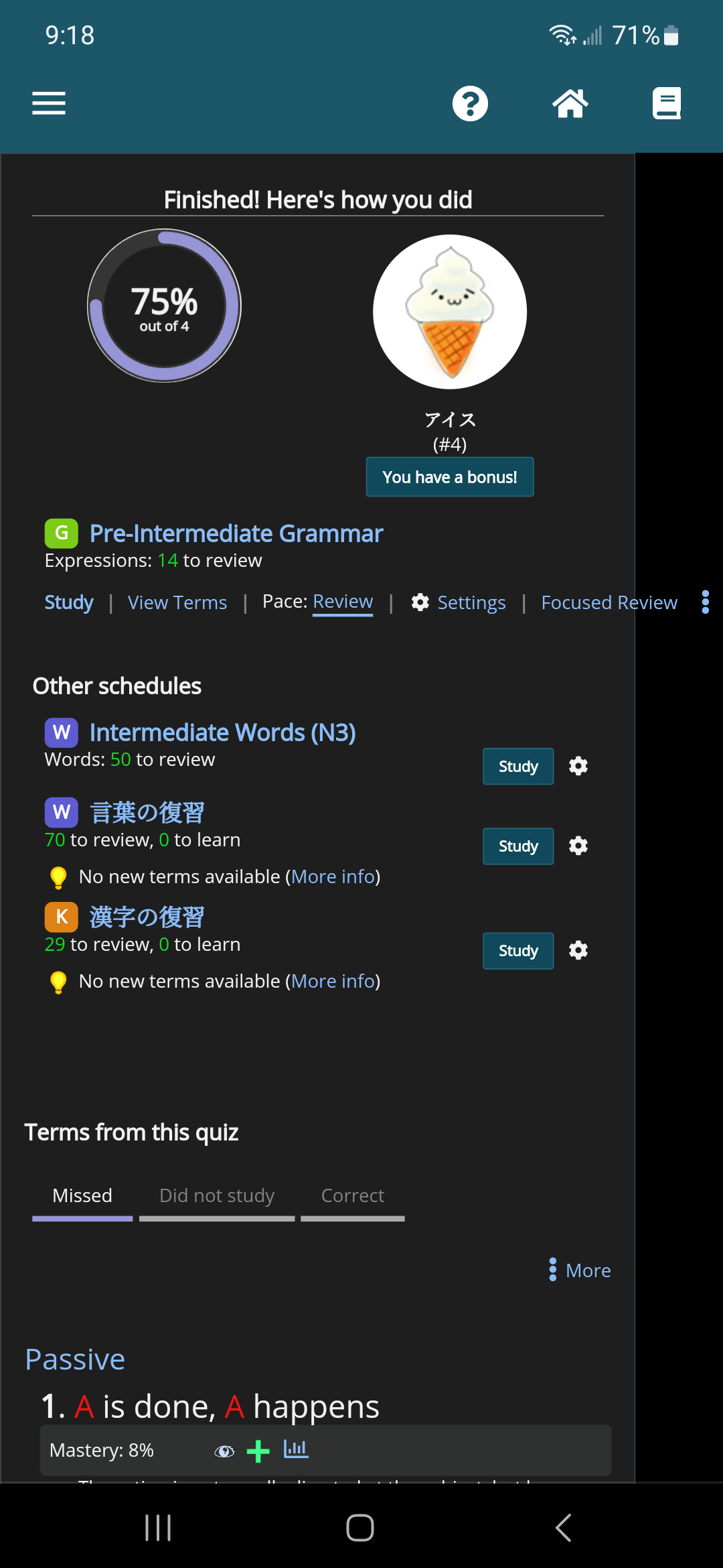
The new layout goes off the edge of the screen when you get to the end of a quiz.

0
5 months ago
Report Content
avatar
Level:

Alright, maybe I was a little bit too harsh on my first post.. uhhh

In my opinion, this new layout of schedule is cool! Its now easier to see your schedule, cool!
But I feel like removing the learn, learn new, focused review on the schedule directly is meh.

Idk if its a bug or so, Its a 7/10 for me!

0
5 months ago
Report Content
avatar
マイコー
Level: 262

No, it was totally missing those buttons, haha. Should be fixed now.

I'm not sure what you mean by removing them - the button is just a link below - that gives you more space to see the title (especially on smaller screens), but no functionality was *removed*.

Also, I think the issue on the finish screen should be fixed, let me know if you still see it.

0
5 months ago
Report Content
avatar
Level:

Oh, whoos..

And also, yeah, can see it now, looks amazing! 10/10


0
5 months ago
Report Content
avatar
WildAtelier
Level: 590

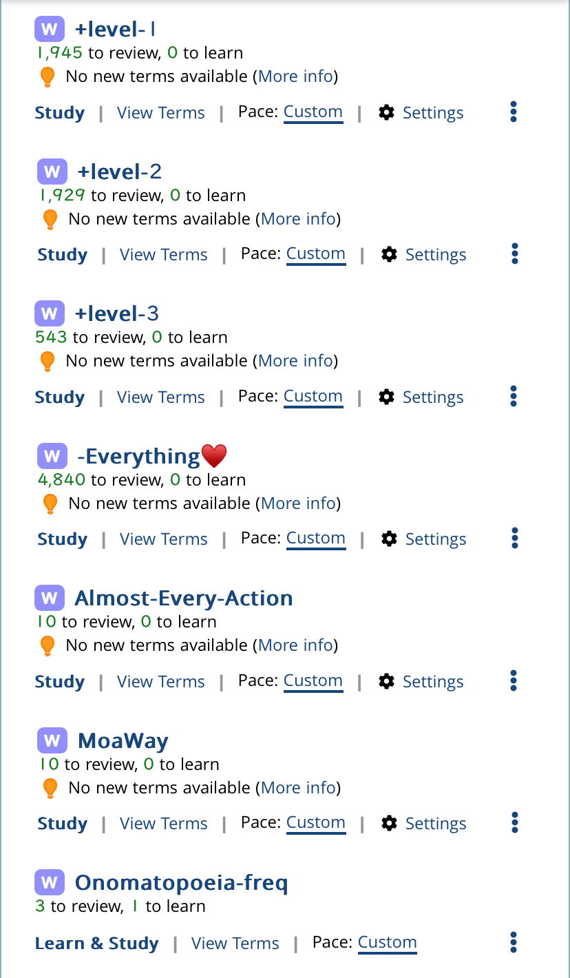
I'm terribly sorry but I personally feel like this is a bit overwhelming. There are so many things to look at for each schedule that I feel visually overloaded.

It also makes it so that I have to read to figure out which menu to click to start the schedule. I personally liked having the slightly larger study button away from the schedule name so that I could reliably click on it without misclicking other things. Plus the way it changed from blue to grey once I was done with my reviews was really satisfying.


It would be nice if we could hide the "pace" info and the "No new terms available" tagline. All I really need to see at a glance from my dashboard is the schedule name, # to learn, # to review, the easy-to-click study button, and the settings gear.

The pace just says custom... which I know that I set it to custom so it doesn't really help me to see that it's custom for every single schedule.

For schedules that I've finished adding new words from but I still go back to review, I don't really need to see that there are no new terms available for most of my schedules. The orange alert being everywhere on this page feels alarming. I have to stop quizzing whenever I get a red dot in the message box so I can clear the red dot, because it's constantly alerting me otherwise. Now there are orange alerts all over the page but no way to clear them.

The terms in each schedule are also viewable when we click on the schedule name (the whole list and lists by mastery level). Is it really necessary to have a direct link on the schedule page?

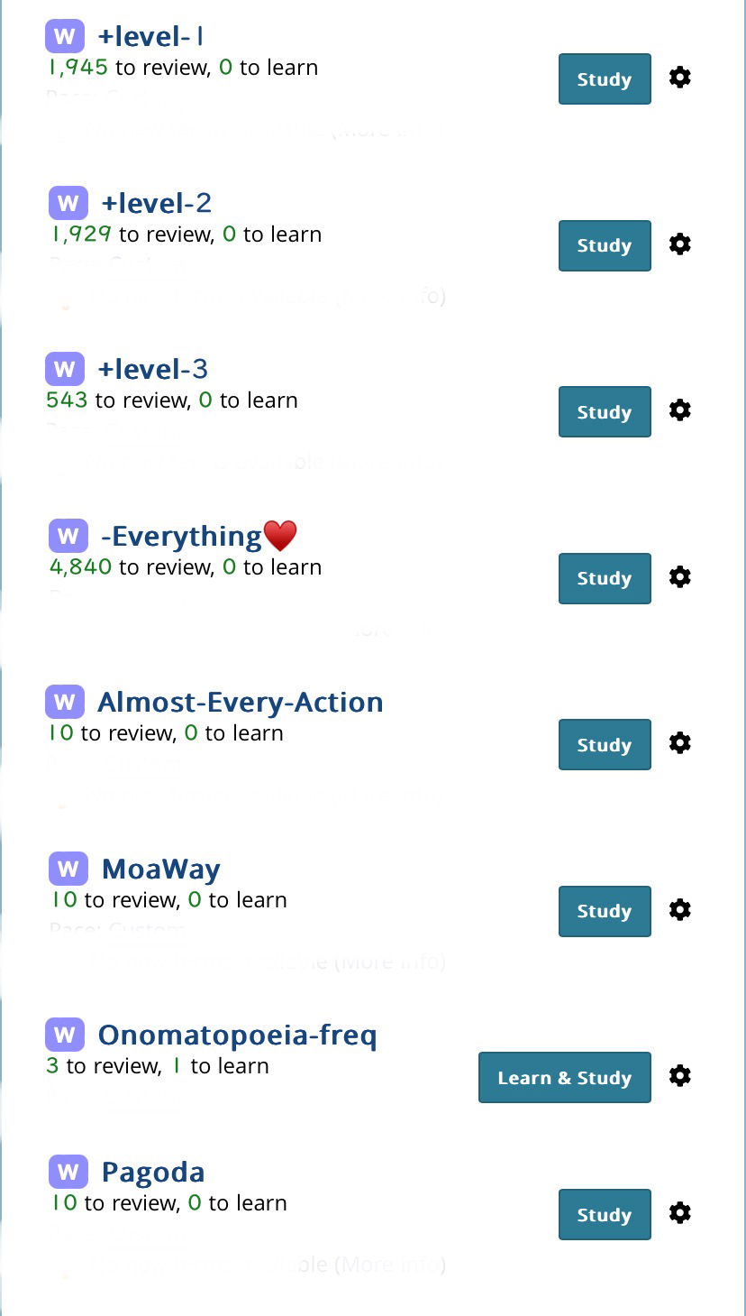
Please may we have the option to have a minimal schedule layout?


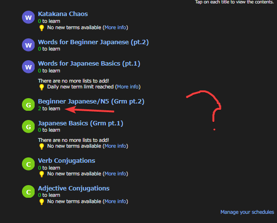
Like this but with slightly less space in between the schedules after taking all extras out. Minimal but easy to understand at a glance!

4
5 months ago
Report Content
avatar
マイコー
Level: 262

Thanks for the feedback - let address each point (not necessarily in order):

1. A huge number of users would like easier access to the terms in each schedule - that has been made exceedingly clear, and most users are not power users, but casual ones - I do my best to strike a balance between the two groups, but right now, way too many people are saying "I cannot find x, y, and z in the schedules", so this is to help address that.

2. The study link will always be on the left. I tried (earlier) doing a button style for that first link, since it's the main one, but it didn't look good. That being said, most users (casual or otherwise) do not have the visual width that you do, and the large buttons plus longer schedules was causing a lot of cropping and bumping into one anther, so "Japanese Basics" might be "Japanese Ba..." for many users.

3. I think adding a way to hide those no-new term alerts would be excellent, and I think I can do that.

4. While I do see where you are coming from with regards to the blue/grey dynamic, a good number of people see "grey" as "not clickable" - while I know that many people do not see that, it felt like the blue buttons were "on", and the focused review ones are "off"

As I noted before, this is not a final draft, so I really appreciate this feedback, and hope to get more like that. I have no doubt I can continue to improve on the design and fit in the wishes of the majority of users.
2
5 months ago
Report Content
avatar
Anonymous123
Level: 1205

I think my ideal layout would eliminate all the commands on the dashboard (as shown below), since I always click on the schedule name to access those anyhow. But, the new layout seems okay.


0
5 months ago
Report Content
avatar
Sullydude
Level: 27

the pop up window from clicking on the 3 dots next to schedules on the new layout doesn't format correctly, causing everything to be cut off and have scroll bars.

0
5 months ago
Report Content
avatar
Level:

なに !?

0
5 months ago
Report Content
avatar
マイコー
Level: 262

@Froggie_Newbie what page is that, and did you adjust anything with the schedules that make them act that way?

0
5 months ago
Report Content
avatar

I do miss the start button. Can the colored icon be turned into a button, or would that be too confusing?

2
5 months ago
Report Content
avatar
Level:

@マイコー

I think it just fixed itself

0
5 months ago
Report Content
avatar
マイコー
Level: 262

I'll have more updates/replies tomorrow. For now, a small QoL change for @WildAtelier - that "no new terms" should no longer show up if you switch the pace to Review. (At least, I think I updated it.)

1
5 months ago
Report Content
avatar
gillianfaith
Level: 886

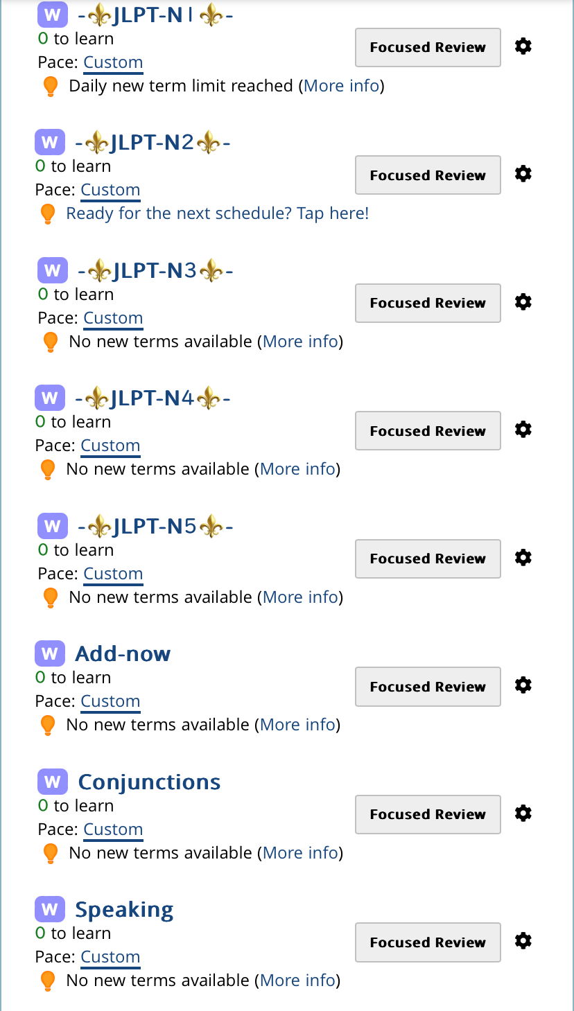
Schedules with "Learn and Study" active seem to be missing an obvious settings button, and on "Compact" and "Very compact" views the list of options overruns the horizontal space on screen on phone (and I don't see a difference between Compact & Very Compact layouts other than how much they overrun that space).

I haven't clicked around enough yet to form much of an opinion, but at first glance I like seeing the options all laid out like this and it seems pretty intuitive. My only suggestions at this point are to make the font size on schedule names bigger and/or bold so they're not less emphasized than the Study button, and make sure the settings button always persists in an obvious place (maybe always keep the gear icon visible even if the text doesn't fit).

Since I always manually sets my schedule settings, for me having the "Pace" option front-and-centre isn't useful and does nothing but take up space in the list, so it would be nice to have the option to hide it (or for it to automatically disappear in the more compact layouts) if that wouldn't over-complicate things.

1
5 months ago
Report Content
avatar
マイコー
Level: 262

Settings are inside the ... menu. As far as spacing goes, I have a fix going in tomorrow.

Some ideas and notes:

1. Of users in the last 90 users, 0.3% have something other than the default display for schedules. The two compact ones are similar enough now that it may be easier to leave the most compact one as it is, then grab the middle option for a less busy one.

2. I am 100% in favor of having a study BUTTON if it fits and looks good. And/or a different, visual "this is done" thing.

3. I think having a very simple ordering tool for the links would work, so you can control what is most likely to appear and not be wrapped up in the ... menu.

4. There is a bug where if you change the pace, the links don't collapse again. It's been fixed, and will go up tomorrow.

1
5 months ago
Report Content
avatar
gillianfaith
Level: 886

Honestly I prefer the compact layouts (I just like the headings for Words/Kanji/etc. over the bubbles), but I'm aware I'm one of like 5 users that use it if it's a hassle to maintain multiple layouts I don't think it's necessary to keep.
Being able to reorder the options would be great! Settings is my most-used option, so having it be the first link to be sacrificed for screen space doesn't make sense, and being able to customize that would fix it for me. I do still think that even with that feature, Settings should be a button that's never hidden though, just based on how often I direct new users to schedule settings when they have a problem or want to accomplish something specific. Having it conditionally trapped in the meatball menu will make fewer people aware that customization options exist and make it harder to direct people to them.

1
5 months ago
Report Content
avatar
antimonysarah
Level: 208

I too really miss the ability to scan down my schedules for the ones I haven’t done yet—it’s almost impossible to pick them out now. If the buttons can’t come back, can we get another option to BIG HIGHLIGHT the schedules with reviews due today? I’d be okay with the tiny nondescript start link then.

While stuff is up in the air—I’d love a quick way to pick between “just do the reviews” and “mix in new terms” from the main dashboard, without having to go flip the “only learn new terms after reviews are finished”. Because I like having the new terms mixed in but on very busy days I might only want to do reviews. Especially since this setting is per-schedule so I have to flip it everywhere.

1
5 months ago
Report Content
avatar
WildAtelier
Level: 590

Thank you thank you for giving us a way hide the orange lightbulb! That helps a lot!!

I didn't realize things were getting cut off for people with narrower screens, and I understand newer users who aren't as familiar with navigation might want things to be more easily accessible. I'll try to learn to love the new layout.


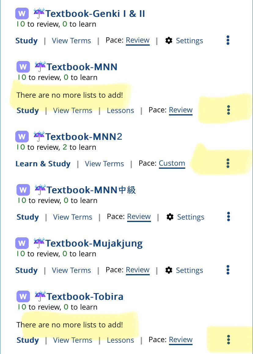
For the Renshuu pre-made schedules when I change the pace to review it says "There are no more lists to add!" for some reason. And because these ones have a "Lessons" link, the settings is getting hidden. Could we possibly make the link for "View Terms" to just be "Terms" in the same way "Lessons" is just "Lessons" and not "View Lessons" so that the settings button can always be visible? If it still won't fit, can it be made so that at least the setting gear icon is still always there? It looks like there is enough room for the gear icon at least?

Also, can the thick underline under the Pace option be removed? I don't think the pace option needs to take precedence over all the other menu options, and with all the vertical lines in between the different link options having another bold horizontal line right there feels a bit jarring.

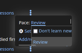
When I saw the update and went to go turn off the orange lightbulbs, the first thing I did was to click the (More info) link and when the additional text told me to change the pace settings to get rid of it, I went into the settings for the schedule and couldn't find it. It took me a minute to figure out that I needed to click on the pace link itself for it to pop up. Maybe it would be helpful for the (More info) text description be updated to tell the user to click on the pace link? Thank you!

0
5 months ago
Report Content
Getting the posts


Page: 1 of 3


Top > renshuu.org > Feature Requests/Improvements > Finished/Rejected Requests


Loading the list
Lv.

Sorry, there was an error on renshuu! If it's OK, please describe what you were doing. This will help us fix the issue.

Characters to show:


Use your mouse or finger to write characters in the box.
■ Katakana ■ Hiragana