I don’t like the new location of the study button, it was easier to click when it was on the right side instead of the left. It might be opposite for left handed people so it might be nice to be able to choose if that’s not too complicated.
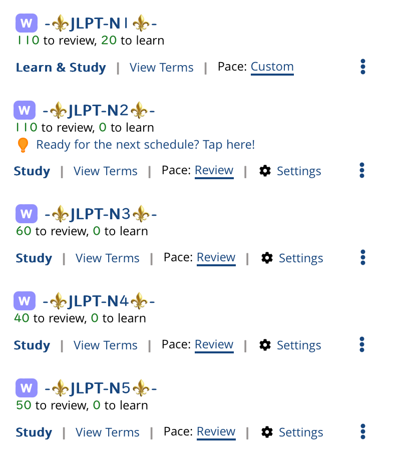
I did add the next schedule (N1) but this "Ready for the next schedule? Tap here!" won't go away. I tried adding it again and merging it with my existing N1 schedule (which is the same schedule just renamed) and I thought it worked but the next time I went back to my dashboard that notice was there again.
I wanted to say thank you for all of the feedback - I feel like I clearly didn't consider everything enough when designing this, and I hope I can improve it.
I also agree that I liked being able to tell at a glance which schedules were finished for the day by the color of the button, that’s the only thing I dislike being changed. It just feels more confusing and visually overwhelming without that to figure out what I need to do next
EDIT: Sorry I didn’t see the last post when I made this, I do like it with the button styling
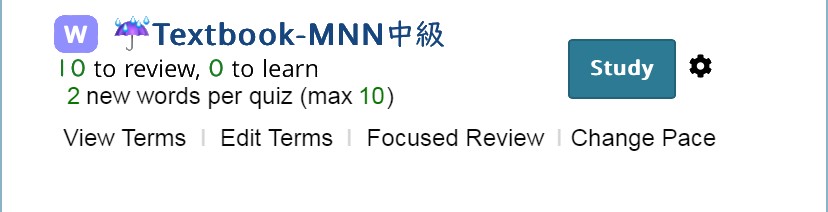
So it looks like the ones where the focused review link isn't fitting is when the button says "Learn & Study" as opposed to just "Study." When there are new words to study it says # to learn right under the schedule name. Would it not suffice to have the button just say "Study" whether there are new words or not? I would imagine that even for a new user, it would only take once or twice to figure out that the button takes them to the quiz and if there are new words they will be introduced at the start?
I was going to come over here and say something about how I think the "Study"/"Learn" button should be blue (styled as before), but looks like that's already taken care of!
Nitpick: I don't think a border line between button and next item is necessary, just adds to visual clutter.
So it looks like the ones where the focused review link isn't fitting is when the button says "Learn & Study" as opposed to just "Study.
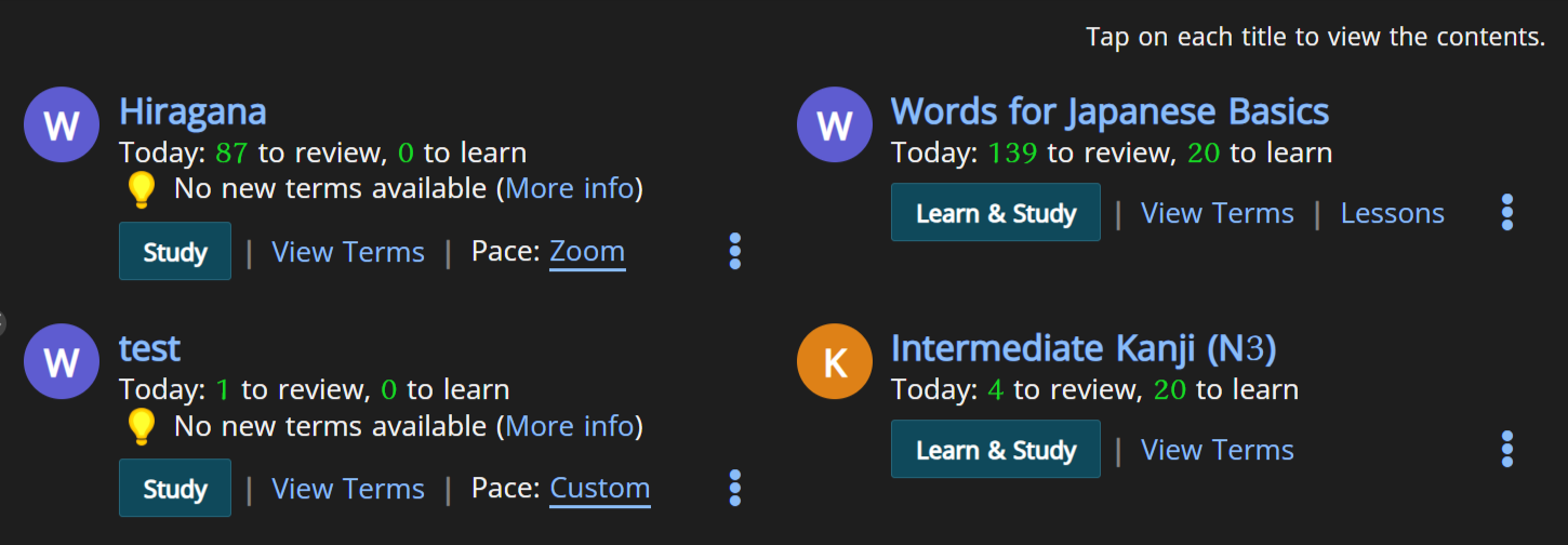
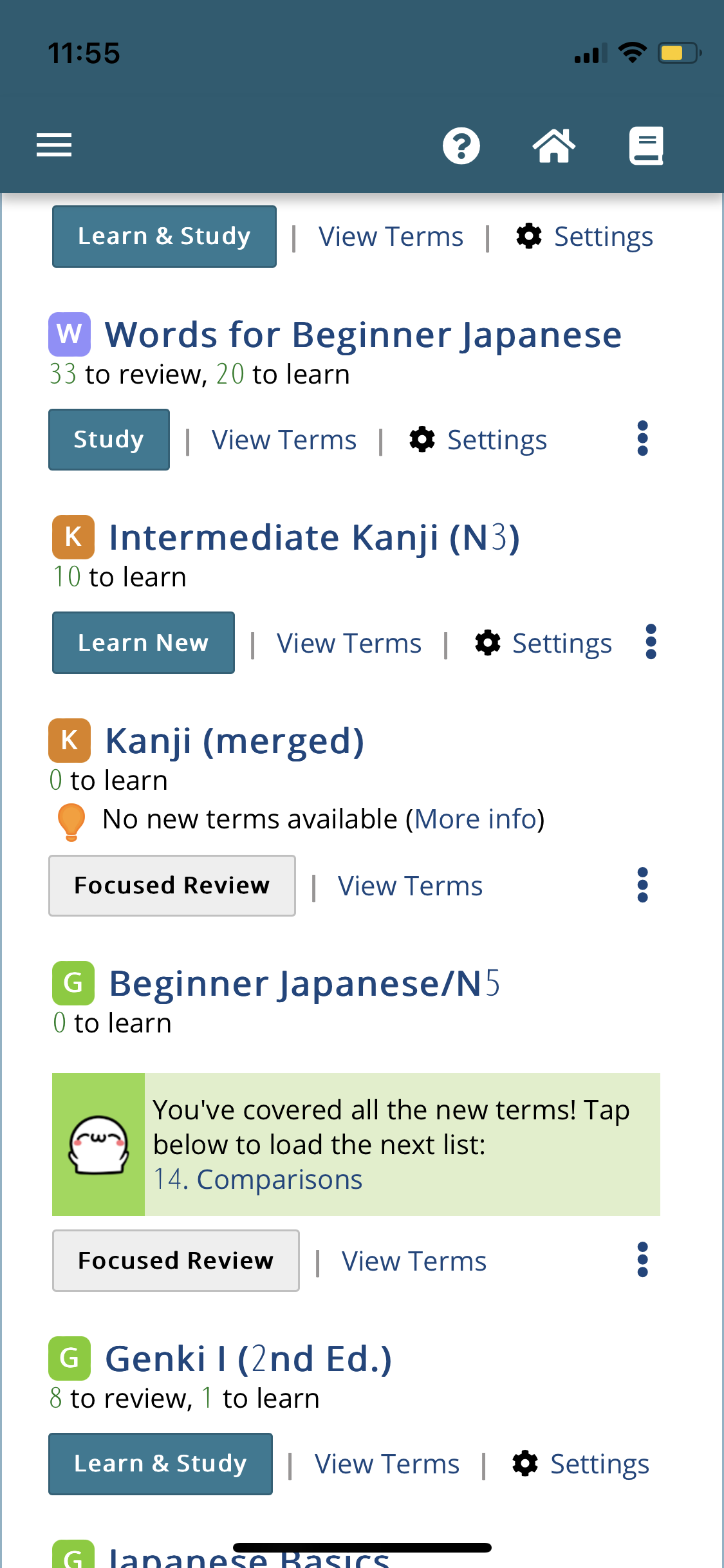
It can wrap all of them on small screens but to me that’s fine? I have a small screen so that I can actually reach the left side, and the new arrangement puts the things I want most in the uncollapsed slots. I like the change of names because I’m often flipping learn new on and off and want to easily see which way I left it. You can see all of the statuses in this screenshot (and also that today’s font doesn’t match the UI very well for Arabic numerals):
I like the change of names because I’m often flipping learn new on and off and want to easily see which way I left it.
The 「# to learn 」 under the schedule does show if you have new words to learn or not. But I imagine the button could be kept smaller yet still show a difference by using a short word such as "New" and perhaps a slightly different shade in color for the button?
The same could be done for "Focus" or even "Review." This would allow more menus to fit below on one line.
The number font issue is known and unfixable (it's done by the external font manager).
While I'm not rejecting name changes outright, keep in mind that most users are not level 400 or even 80, but 1-10 (and of course, I hope to make it easier for them to keep using it). Any name change needs to be taken from the perspective of a user not intimately knowing that usage to begin with, so something like "Focus" or "New" would not qualify.
I don't like Review (I wish I did) because many people would consider the day-to-day quizzes of renshuu as "review", so it needs something extra. Focused Review is super clear, but not. Extra Review is a bit shorter. Review+ <-- maybe?
Would something like "Cram" work, if you need to change button names? Cramming doesn't really fit the purpose IMO, but that seems to be what a lot of users use Focussed Review for (or they ask for a way to cram and get directed to use Focussed Review).
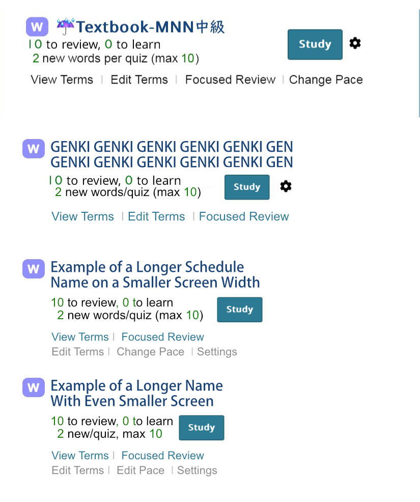
I don't know how narrow the narrowest screen is, but I tried to take your feedback and did a mock up to see if what it would look like in a narrower space. (I don't know what the exact font is so I just used a random font...that on hindsight looks a bit more crammed than the actual Renshuu font, so please take that into consideration)
1. I added a second line under the # of reviews, # to learn to show the pace in actual numbers, because I think it would be helpful to see what the pace actually is than just seeing "custom" or "normal" or "fast" because seeing 6 new words a quiz feels very fast for me while it might feel slow for others. Moving the pace information up here would free up some room in the link lines, while adding more clarity.
2. Having two lines of information regarding the pace and number of reviews for the day would make enough room to fit in the Blue study button next to it, yet under the name of the schedule so as to not get in the way of longer schedule names.
3. I made the example show a wrapping schedule name that would allow smaller screens to support longer schedule names.
4. For the additional links, since having shorter link names can compromise clarity I tried to maintain the longer "Focused Review" name while not having the rest of the links off screen by having two rows of links rather than the three dots. I made the second row in a grey rather than the same color link as the Focused Review so that Focused Review will stand out more as it will probably be used more frequently than edits.
5. I also changed the color of the bars between the links to a lighter grey so the eye would focus more on the links than the dividers.
6. The last example could fit in an even smaller width screen if we took off the purple W square that represents Word schedules and instead made the color of the schedule name for words that purple and change the color of the schedule names of kanji schedules to orange, etc. Alternatively, perhaps the background color for word schedules could be purple and the background color of kanji schedules could be orange?
7. Perhaps the answer isn't to add so many links for editing the terms or pace right under the schedule, but to make the settings page easier to use for newer users? I remember how I was really confused by the settings page when I first started using Renshuu (but I really really really love how many customizable options there are, it was just a lot to take in at first).
Thanks for the mockups! It can get really "busy" when you there's that much, additionally making those much harder tap targets for people's fingers. One finger could hit three of the links on the bottom two lines. Even with shorter words, zoom scale has to be considered, as well as non-English languages - some of them have MUCH longer names for simple actions.
The short of it (and this is the insanity that is design like this) that no matter how optimized it is, a different set of variables is going to break something, so it needs to be built to handle varying widths of text, font-sizes, and user expectations. Almost impossible to please everyone, but the short of it is I've seen enough screenshots to know the button on the right is just too much pushing on the rest of it, and there has to be enough breathing room between elements that they can be tapped.
Removing the W box and changing the colors makes the user have to know what the colors are in the first place, and then you lose the blue that hints at the link that you can click on.
I spent the first three of my years in uni as an electrical engineer, so the desire to optimize and jam things together is a permanent part of my brain, and I completely understand where you're coming from. I still cannot claim to be a good UI/UX designer most of the time, but I am confident in saying that making "button on right" so important that everything else takes a back seat to it is going to result in a net negative for a lot of users :(
No, I really do appreciate it - discussions like this also help open up my side of things to the users - a lot of users will say "hey, you should change this size/spacing/alignment/whatever", and from their perspective, it's an obvious thing, but when you mix in 15 different factors, things change a lot.
So, having you (and others following this) being able to see that helps me better explain why I make certain choices.
I definitely want to shrink down the names a bit, though! And maybe next week, get the ordering tool in.


 Well, I just wanted to give it my best shot. I would have felt amiss if I didn't at least try
  Thanks for indulging me
