AS WITH ALL EXPERIMENTAL SETTINGS, THIS MUST BE ENABLED IN SETTINGS. BEWARE - THESE ARE UNSTABLE CHANGES.
Textbook Font Mode
Goals: 1. Allow users to swap out the current Japanese font (made with digital media in mind, but not great if you want to learn how to write kanji) with one similar to what appears in Japanese textbooks when learning kanji.
Known issues: 1. The initial load up is 5-6 seconds. After that, any pages loaded come up very quickly. This is why the Super Speedy mode is required. If you refresh the site (using F5/etc), the initial load up has to go again. Think of it like opening up MS Word initially - has a bit of load time for the first document, but following documents are much faster. 2. The visuals on the page for the load up are far from ideal. It needs to be changed to grey over/loading icon until things are loaded.
This thread is for bugs and discussion of this feature. NO OTHER THREADS should be opened regarding this.
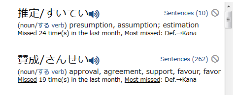
Not sure how difficult this is going to be, but could this font be limited to Hiragana, Katakana, and Kanji only, but leaving other portions as they are? Or if that is not possible to change font sizes a bit? The reason I am asking is because while Japanese texts are quite good to read with this new font, I find English texts a bit harder to read. Comparison screenshots: In the new font, latin letters generally are smaller and seem to have less space between them. See also the Study New button where it now looks like the N and e in New are glued together:
I'm working on that, as that is a requirement in my head, as well. I want separate fonts for Japanese and not Japanese, do I think we're on the same page in terms of expectations.
So, even for text that is not affected by it, there is still some alignment/spacing that is changing. That is hopefully something I can fix, but it'll take time. Otherwise, the whole thing might be a wash =/. Which would be a shame, because I just love the look of this font.
Edit: still converting a lot of the text that it shouldn't be.
Where am I supposed to see this super cool font? To me everything looks the same as before, only now the pages are loading slower than before. Is there another step to follow in order to get the font? Or is my outdated win7 having problems with the new implement?
It does take longer, yes, which is why a switch to the speedy version (which is more like an app, where everything is loaded up front, then just the page contents change, so the font does not need to be loaded multiple times.) is needed. A slower computer will take more time, just like it would take more time to start up a piece of software.
Once you enable both of them and refresh the page, does the screen go grey first, then become visible after everything is loaded?
It does work on mobile and I like the look. So, thumbs up.
As for my desktop it doesn't. Yes, I enabled both settings. And I know my pc is slow, but reloading the page results in endless loading. I have to go back to the dashboard and open things from there in oder to make the site work at all. It looks kinda greyish when loading, but I don't get to see the new font. On mobile all text etc. disappeared for a split second before reloading with the new font. I don't have that phenomenon on my pc, so I suppose it's not loading properly?
Definitely sounds fishy. It's going to take a lot of work to get everything stable, which is why they're marked as experimental. This'll hopefully be a big part of the next beta, but it's going to take time, which is why I introduced them early on.
It is "supposed" to disappear for a second while it loads the new font. I am thinking about what to do then. With the grey overlay, I'm considering just hiding everything in the body of the page until it is loaded, so it is either a)blank, or b)fully loaded, instead of having so much visual flickering during load.
This setting seems to interfere with some site functions. (mobile version) 1. I did not receive a notification that you replied to my last post. Meaning, that marker on the envelope didn't show up. 2. I tried to upload some vocab pics but I can't scroll through the pictures. (during or inbetween quizzes) I also couldn't scroll through the kao coins right after the quiz finished. (btw that いちごだいふく looks fishy o.Ô)
I can almost guarantee these are due to the speedy version, not the font thing. I'll look into it soon! I'd turn off speedy mode for now, as I probably cannot get it all fixed today (and going on a short vacation from tomorrow).
The いちごだいふく is amazing in so many ways! It's one of my favorites :)
I can confirm that the load times are rather long now compared to yesterday. Maybe I was just too impatient but I had to first allow scripts from typesquare for the site to actually load the fonts (at least then I got browser status messages indicating that stuff is loaded).
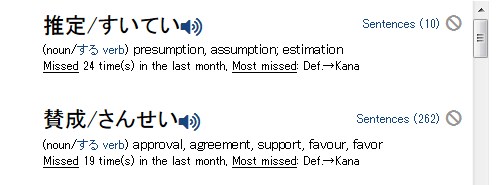
I still think that the current font is a bit too small for non-Japanese portions (but slightly better than before), as can be seen here:
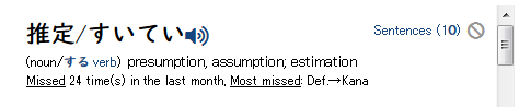
also, zeroes look different to other numbers as can be nicely seen here [EDIT: just noticed that you mentioned yourself that the 0 looks strange, so "all good" here... :)): All of that said, I also really like the Japanese font, just have to figure out a way to have the latin font easily readable/larger as well :)
Another thing I just noticed, while the font is active, kana entry no longer automatically translates my entered latin characters into corresponding hiragana equivalents - I only activated the font option and did not change anything else compared to my other setings.
Unfortunately, this is looking more and more unlikely - there are some inherent drawbacks to these font systems that I do not think renshuu can get around. Anyway, if any headway is made, it'll be in a week.