I was actually focusing on 第九 in the second screenshot, but oh well. It's weird though, because it only looks like that on Windows 10. On Linux and Android it looks the same as always. I guess I need to find some better fonts for Windows...
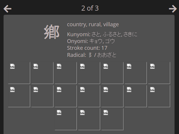
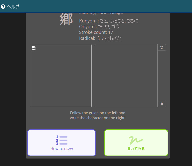
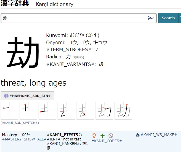
I noticed an issue with the new kanji introduction page. If there is no images for how to draw a particular kanji, instead of not displaying the relevant sections, broken image icons appear instead. Also, I wasn't sure if you colored the buttons at the bottom by type or not, but currently they're colored by position, so the first button is always blue, regardless of which button that is, and so on.
I did a drag and drop kanji quiz in the study center, and some of the words used were 嘱目 and 伸展. Thing is, I don't have either term in a schedule, but in the answer panel for the set of questions they were used in, both terms had a green add to schedule icon in their boxes. I looked up the words in the dictionary, and the icons there are grey like they should be.
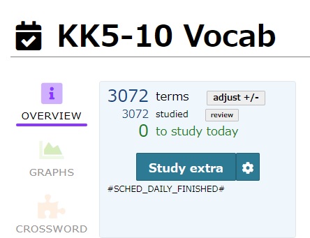
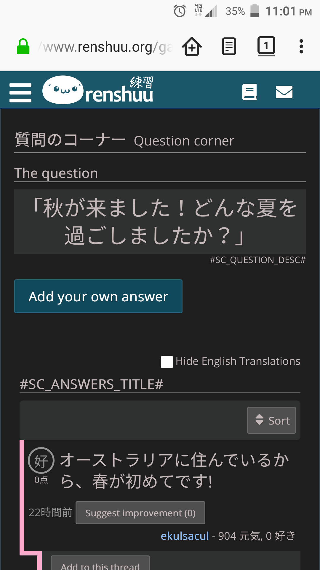
This is what I get for working on the site when I'm sleepy. It's been really hard finding time for beta as of late, which is forcing me into non-ideal times for working on the site. These should all be resolved (the text strings). Not sure about the scrolling issue, let me know if you can replicate it reliably.
On mobile, the position of the accuracy % bubble in lesson lists is inconsistent, sometimes switching between left- and centre-aligned halfway through the list.