I don’t know if it’s late onset colorblindness or what, but I find it extremely difficult in certain lighting conditions to distinguish in vocabulary listings the green plus sign (already added) from the gray plus sign (not yet added). Dark mode helps, (I am using the iPhone app), but I think changing the shape in addition to the color would be more user friendly.
I am slowly making changes to colors to better accommodate color-blindness, etc. So I'm glad to hear about another spot for improvement.
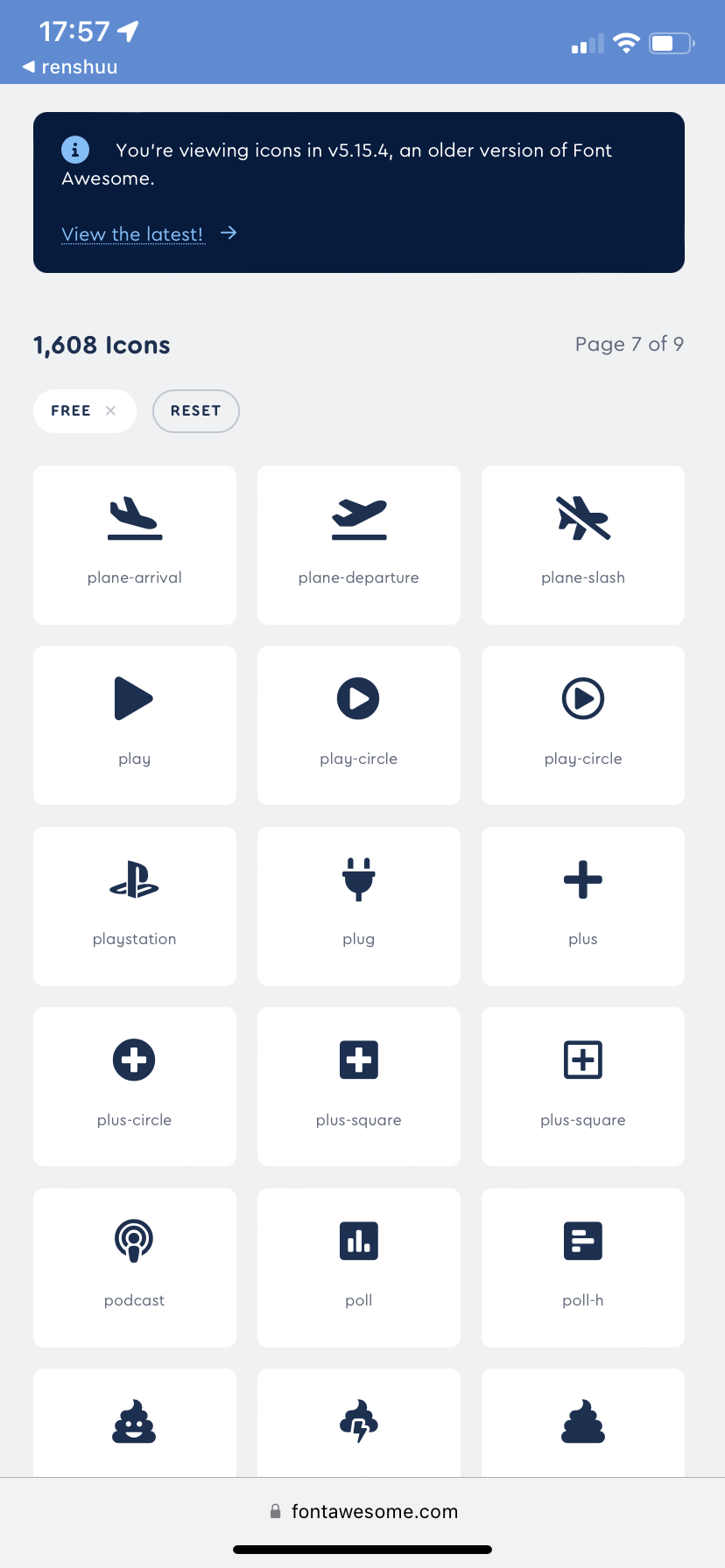
I do not think, as you said, that just a color change could be sufficient. I am not sure yet what icon change, though, would sufficiently work. renshuu uses fontawesome's 5.x icon series, and the unfortunately do not have a plus outline, which would be an awesome way to do it.
I often use Renshuu on an e-reader, so everything's in greyscale and the green plus ends up being a very similar tone to the grey one. Having them slightly different shapes or with more pronounced dark/light contrast would really help.
I've already made a few changes (probably not in areas you are using) to accompany colors with other visual cues, but it is definitely a work in progress.
I tried the experimental “color-blind” setting tonight, and I really like it. The blue is so much easier for me to read than the green. I was enjoying the experience so much I almost didn’t notice how many mistakes I was making.